What a tour guide website needs to get more bookings
Short answer
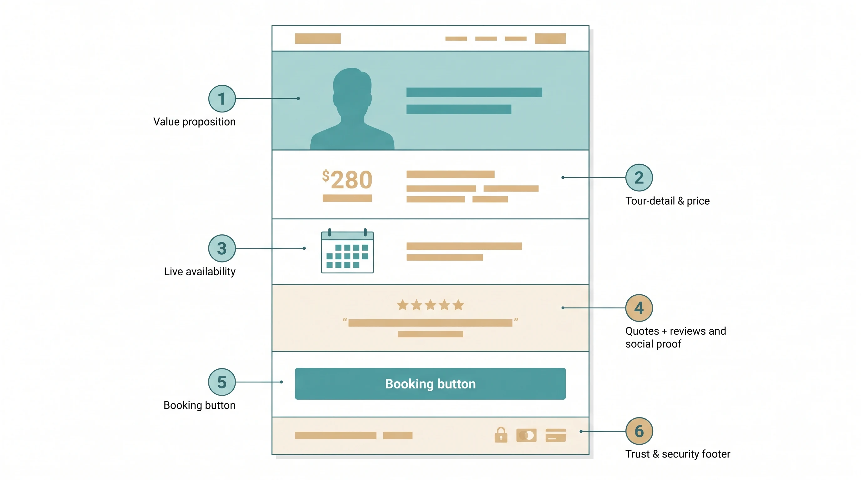
A tour guide website converts more visitors into bookings when it gets five things right. It needs a clear opening photo and headline, a short bio about you, trust signals like reviews, clear tour details, and a booking button that's easy to find.
Who this is for: Any independent guide who wants their existing website or booking page to turn more visitors into bookings. No web-design or coding knowledge assumed.
If your tours aren't getting booked online, it's easy to think the answer is "a better website." But before you spend money on that, it helps to separate two different problems that people often mix up:
- Traffic — how many people find your page at all. This comes from Google, Instagram, word of mouth, and review sites.
- Conversion — of the people who find your page, how many actually book. This depends on what's on the page itself.
A guide with a traffic problem has a quiet page: not many visitors. A guide with a conversion problem has visitors who arrive, look around, and leave without booking. Fixing one problem won't fix the other. Sending more traffic to a page that doesn't convert just means more people leave without booking. This guide is only about conversion: what your page needs, whether you build it yourself or ask someone else to build it.
One quick note before we start: not every guide needs a full website with many pages, a blog, and an "About" page. A single booking page — just one page that shows your tours and lets someone book — is often enough, for years. Whichever one you have, it needs the same five things below to convert.
What makes a page turn visitors into bookings
| What it is | What it does | The mistake that ruins it |
|---|---|---|
| The top of the page (what loads first) | Tells the visitor, in one glance, what they get | A stock sunset photo and a vague "Welcome" message |
| A short bio about you | Reminds people they're booking a person, not a company | No bio at all, or a generic "About us" paragraph that says nothing about you |
| Trust signals (reviews, security badges) | Removes the risk of paying a stranger | Reviews hidden on a separate page nobody clicks |
| Tour details | Answers "is this for me?" without needing a message | Duration, price or meeting point missing or vague |
| The booking button | Turns interest into a booking | Only visible after scrolling past everything else |
Get these five right, and everything else on the page is optional — extra photos, a blog, a fancy design. None of them make or break a booking.
1. Start with one clear opening
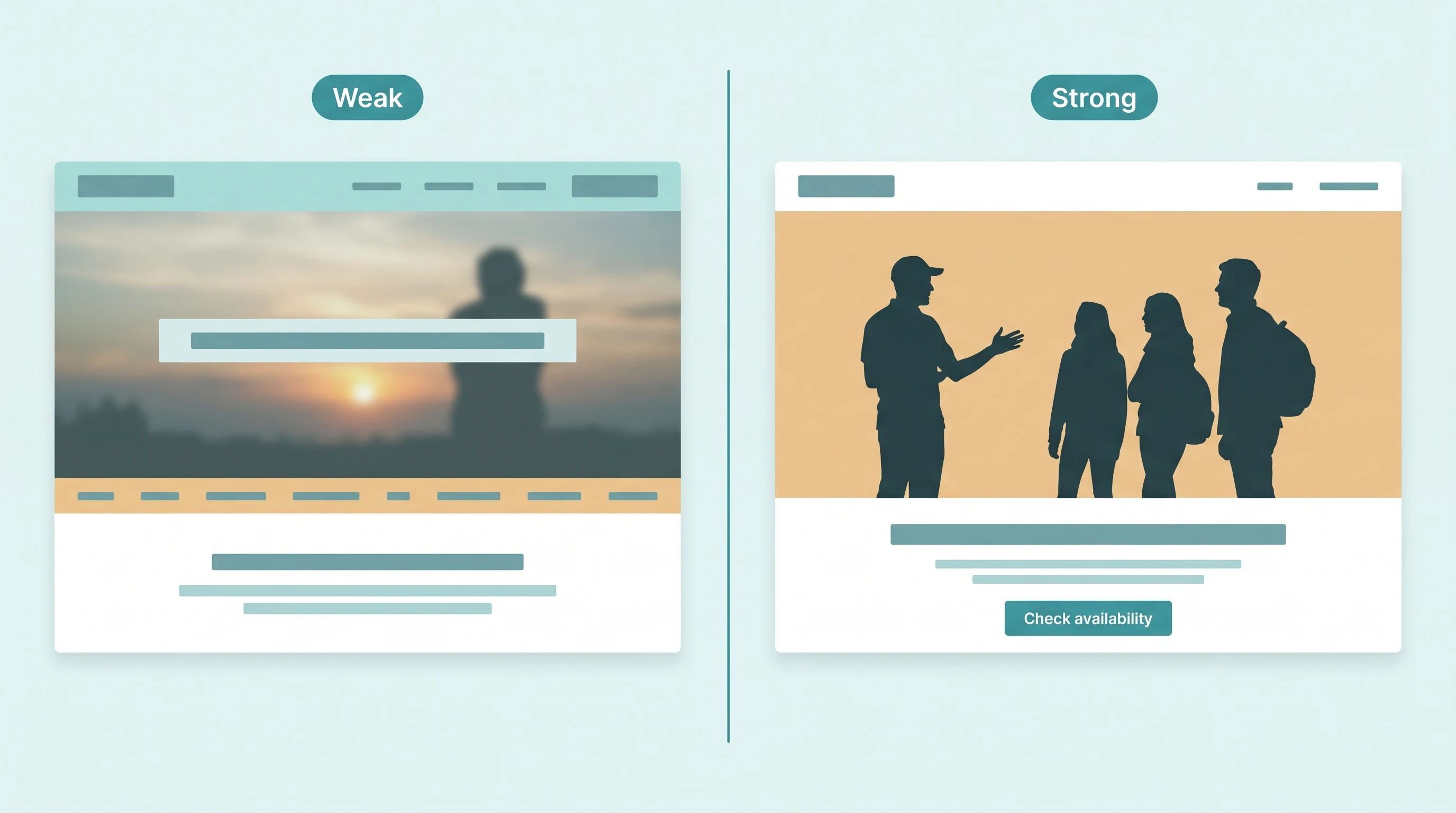
The very top of your page is the first thing anyone sees, before they scroll. It matters more than everything else on the page. You only have a few seconds before someone decides whether to keep looking — so this part has to do one job well.
Use a real photo of you leading a real tour, not a generic stock photo of a sunset. A photo of a real person in a real place always works better than a beautiful but generic image. Pair the photo with a headline that says exactly what the visitor gets — for example, "3-hour food walk through the old town, small groups only" — instead of a slogan like "Welcome to our tours." Then give the visitor exactly one thing to do next: one clear button, not five links competing for attention in a menu at the top.
2. Add a short bio
A few sentences about who you are make a big difference. A stranger is trusting you, not a company, to show up and lead a good tour. A short bio doesn't need to be long or formal. Include your name, a real photo of you, how long you've been guiding, and one or two things that make you the right person for this tour — for example, you grew up in this neighbourhood, or you're a trained historian. Keep the bio near the top of the page, or one click away on a clearly-labelled "About" link. Don't bury it three pages deep, where nobody will find it.
This is different from the short line about your experience that sits next to your name and the price, further down the page — that's for someone reading quickly. The bio is for the person who wants to know more before they book.
3. Show trust signals near the price
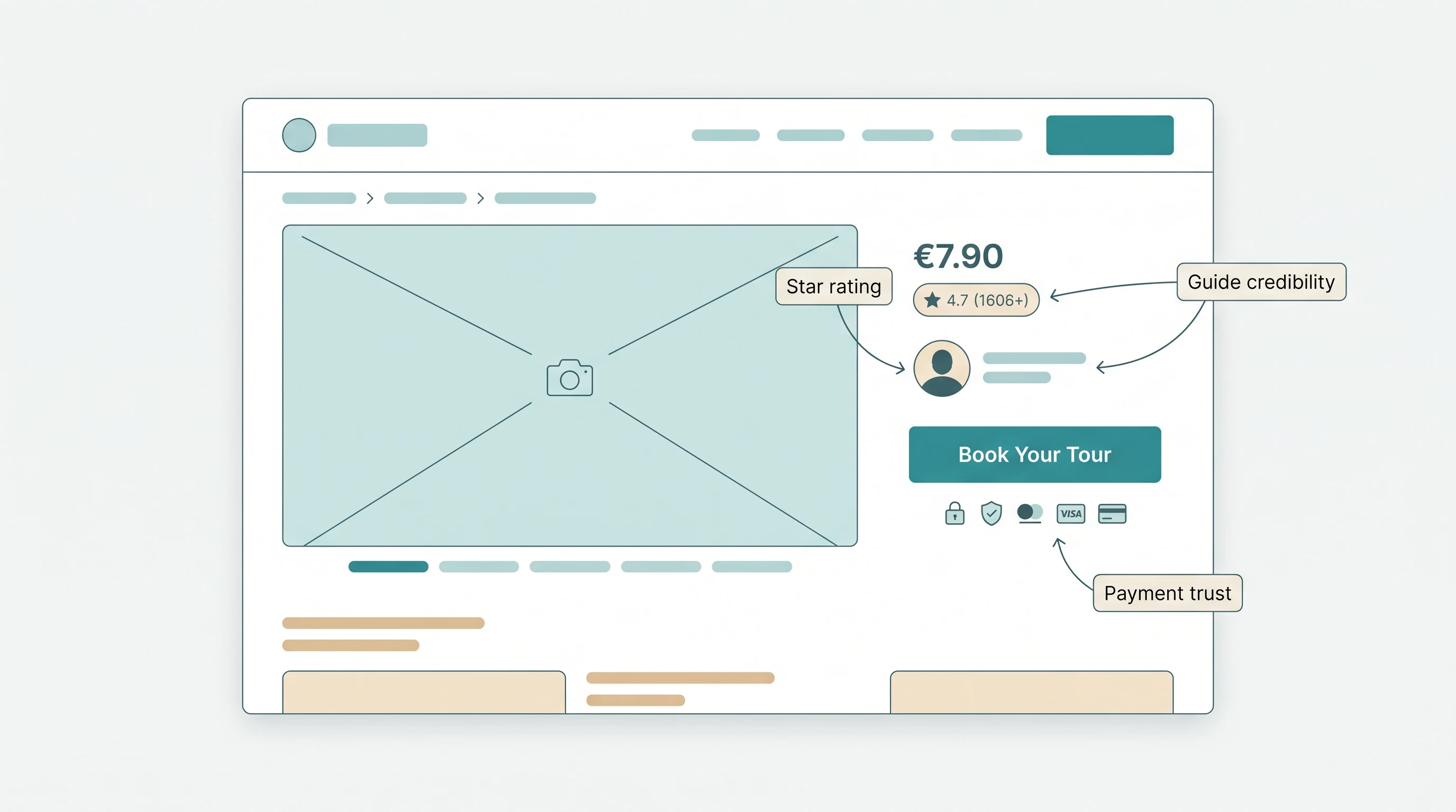
Reviews, a photo of you with your name, and small icons showing accepted payment methods — all of this makes a stranger feel safer about paying you. But it doesn't work if it's hidden on a separate "About" page that almost nobody visits. These signals work best right next to the price and the booking button — the exact moment someone decides whether to pay a stranger. Put a star rating beside the price. Put your photo and a short line about your experience beside your name. Put payment icons under the button. Each one lowers the same doubt, right where it matters most.
4. Make the tour easy to understand
A visitor shouldn't have to message you to find out the price, how long the tour takes, or where to meet. Answer all three on the page itself, in plain words. Don't write "prices vary" or "message for details" — being vague doesn't make people curious, it just gives them a reason to leave and book with a guide whose page does answer clearly. If something really does vary by group size or season, say so and give a range. That's still much more useful than saying nothing. The booking page guide has the full list of what every tour listing needs.
5. Keep the booking button easy to find
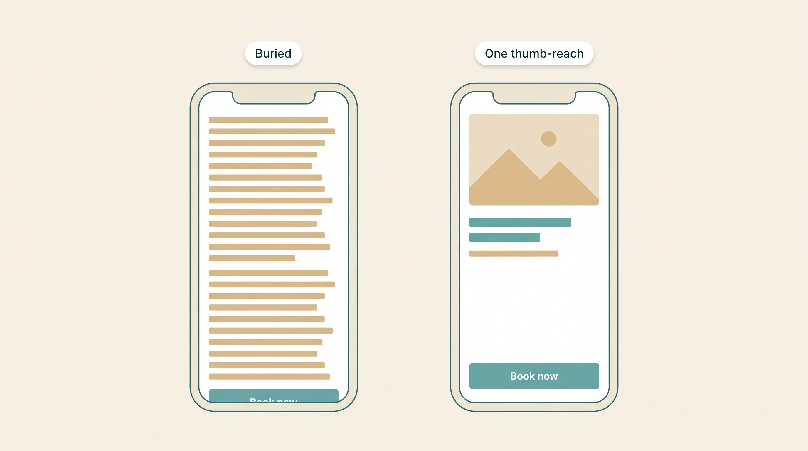
Most travellers research and book on their phone — often standing right in front of the place they're deciding whether to visit. If the booking button only appears after scrolling past your whole bio and a photo gallery, most people never reach it. They just give up. Ask whoever manages your site to keep the button visible at all times. For example: fix it to the bottom of the screen, or repeat it near the top and the bottom of a longer page. That way, nobody has to search for it.
The button itself is usually the hard part. Adding pages and photos to a site is easy today — a builder like Wix, Squarespace, or WordPress handles that well, no coding needed. Making that button check real availability, take payment, send a confirmation, and never double-book a slot is a different job: it's a separate piece of software. All my tours is built to be that piece — either as your whole booking page, or as a booking widget you add to a site you already built somewhere else, like Wix.
When a nicer-looking website isn't the problem
If bookings are stuck, redesigning the page is often the wrong first step. If your page has no real-time availability, no way to pay, or no reviews yet, a nicer design won't fix that — it's like painting a car that has no engine. Start with the five things above on the simple page you already have. The direct-bookings playbook covers how to bring people to the page once it's ready. Only think about a full redesign once those basics are in place.
Putting it all together
Put together, a page that converts follows this order:
- An opening that says what you're offering
- A short bio, so the visitor knows who they're trusting
- Trust signals — reviews and payment icons — right next to the price
- Tour details and a price the visitor can act on right away
- A booking button that's always easy to find
None of this needs to look fancy. It just needs to be there, in the right order.
Remember: none of this brings people to your page. That's the traffic problem, not the conversion problem this guide covers. Once your page is ready to convert, SEO helps more of the right people find it.
Facts used
- The idea that trust signals work best right at the moment someone decides whether to pay is discussed in Atlas Perk's trust-signals guide.
Frequently asked questions
What's the single biggest thing that helps a tour guide website convert?
An opening photo and headline that says, in one glance, what the visitor gets and what to do next. If someone has to scroll or think before they understand the offer, most of them leave instead of booking.
Do I actually need a full website as a tour guide?
Not necessarily. A single, simple booking page — showing your tours and letting people reserve one — does the job for most solo guides. A bigger website with a blog and multiple pages is optional, worth building once you outgrow the simple version, not before.
What's the difference between a traffic problem and a conversion problem?
Traffic is how many people find your page at all — through Google, Instagram, or word of mouth. Conversion is what happens once they're there: whether they actually book, or leave without doing anything. They need different fixes, so it helps to know which one you have before you change anything.
Do I need a custom-designed website to get bookings?
No. A simple page with a clear photo, honest tour details, visible reviews and a working booking button will do better than a beautiful site that buries its booking button. A nicer design only helps once those basics are already in place.
How much does it matter that my page works well on a phone?
A lot — most travellers are researching and booking on their phone, often standing right in front of the place they're deciding whether to visit. If the booking button isn't visible without a lot of scrolling, you're losing bookings you'll never even hear about.